I know, I know. It's very important that a website does not look like an old potato bag. But for search engines and users who want to scan websites, it's not that important. So this section will hurt. A lot.
Content first, design second
First, if I was a computer or an HCI (human–computer interaction) maniac, I would say that colors and images don't matter at all. Fortunately, I'm welling to compromise and say that humans (some) are not computers. But since we still have to write a guideline and this should be it:
“Design is there to allow people access to the content” (Nielsen, 2000, p. 77).
Images
One of my favourite quotes from Jakob Nielsen is this one:
“Generic and pointless images are about as compelling as a garden slug” (Nielsen & Pernice, 2009, p. 196).
Ouch. This is hard to hear because we humans have the tendency to put images everywhere only because they look nice.
The thing is, according to eye tracking, users “ignore stock images 85 percent of the time” (Nielsen & Pernice, 2009, p. 213) and "users appreciate a short page with clear, large text or a single, useful image” (Nielsen & Pernice, 2009, p. 200).
The bottom line is that we should lay out the page differently instead of adding images only to fill white space (Nielsen & Pernice, 2009).
“Web pages are not bank accounts: Full is not better. Cluttered or difficult designs make people less likely to find what they want” (Nielsen & Pernice, 2009, p. 47).
Also, on images, “people look more at images of attractive people who also look real and have imperfections than they do at stock art or perfect faces” (Nielsen & Pernice, 2009, p. 230).
Colours
Another of my favourite quotes from my friend Jake:
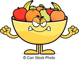
“Don't over-do it. An interface should not look like an angry fruit salad of wildly contrasting, highly saturated colors” (Nielsen, 1994, p. 119).
Here it's more about branding, but also about usability.
First, McGill primary and secondary colour palette does not include blue, pink, brown or orange. Here's what you should use:
- Red #ED1B2F
- Black #000000
- Grey #D7D7D9
- White #FFFFFF
Also, to make sure the website does not transform into an angry fruit salad, please use simple HTML markup language and our centrally defined stylesheets (Nielsen, 2000).
Can't see this image? Here's a text version.
References
Usability engineering by Jakob Nielsen
Designing Web usability by Jakob Nielsen
Eyetracking Web Usability by Jakob Nielsen and Kara Pernice