
This article is a behind-the-scenes look at the content we'll cover in our completely revamped Designing Digital Experiences with the McGill Brand course. Sign up now to look at real-world examples and participate in lively discussion about how to leverage the McGill brand and the principles of good design.
In an environment where priorities and websites evolve over time, it's easy to end up with the web design equivalent of an all-dressed pizza. (Imagine eating an all-dressed pizza. Can you easily isolate the taste a single ingredient from the glorious medley of flavours? Probably not.) Websites are not like pizza: users don't usually consume all your content, so they don't appreciate having it all jumbled together. Instead, they rely on design choices to help them forage for the morsels of information they need.
In our first instalment in the "Design Principles" series, I'll guide you through UX design principles that help users efficiently find and consume important content. These principles form the basis of good design! Future instalments will cover aspects of aesthetic design that can boost the visual appeal of your site.
Chunking
Chunking is an essential UX concept with huge repercussions for your audience's experience. Chunking means breaking up content into smaller units (or chunks!) that are easy to understand and remember. Judicious chunking makes web interfaces perform better every sense.
Experienced web users and sharp observers often have an innate sense of what makes a comfortable chunk. In addition to content length or volume, formatting and visual hierarchy play a role in defining chunks and making their meaning easier to assimilate.
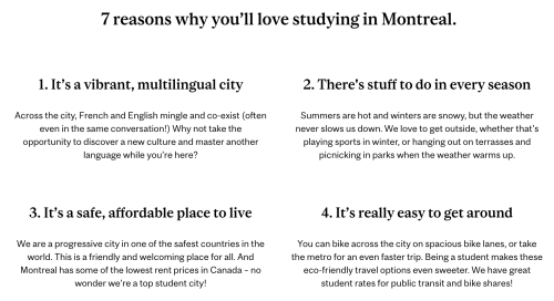
In the example above, you can see how each reason to love studying in Montreal is broken into a chunk comprised of a short heading and concise paragraph. This approach was designed to appeal to potential applicants, who need a concise and memorable summary of what distinguishes McGill from other universities.
To evaluate how you should chunk up your content:
- Consult industry research to get a basic sense of what constitutes a satisfying - but not unwieldy - content grouping.
- Review leading websites in your field. Look for commonalities in how the best sites break up and structure their content: this should give you clues about what your users expect and the type of chunking they're most comfortable with.
- Conduct user testing (the Web Services team can help!). Testing with real users is the best way to identify a chunking strategy that works for your content and target audience.
Once you have a sense of how to break your content into user-friendly chunks, you can apply the following principles to enhance users' ability to read and recognize important information.
Proximity and region
In order to leverage chunking, you'll need to show users which elements belong together and should be read as a chunk.
Proximity and region both help users understand relationships between elements in an interface. When related objects are close to each other - and farther from unrelated elements - their relationship is represented through proximity. If related objects are contained together inside a box or an outline, their relationship is communicated by a common region. These concepts are key to helping users efficiently perceive structure in a layout. Using these two principles well can help you avoid unnecessary dividing lines, boxes, and explanatory text in your layouts.

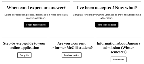
For example, the proximity of the title, event listing, and "view more" in the left column above helps your eye interpret the Web Services training and events as a collection of related information. The space between this collection and the neighbouring one (WMS training) provides the sense that these are two separate groups of content. On the right, the "Coronavirus announcements" block uses the principle of common region to express the relation between the title, listed content, and "more" link.
When you use blocks, you'll automatically benefit from design choices around proximity and region. When you use WYSIWYG tools (e.g. ghost buttons, columns) and HTML classes to build layouts, you'll have more leeway. This means that proximity and region are especially important concepts for advanced users of the WMS. Be sure to evaluate how proximity and region are represented on a variety of screen sizes - an extra line break or column arrangement that works well on your desktop may render differently on smaller screens.
Scale
Scale is one of the most basic design principles, and one of the easiest to grasp. UX research leader Nielsen Norman Group defines scale as "using relative size to signal importance and rank in a composition."
When we work with site managers, we often hear things like, "This content is important, so I made it big!" This impulse is motivated by the principle of scale...but there's a little more to it than that. To use scale effectively, you'll need to consider two things: which chunks of content or topics are most important, and which aspects of the content will help users find the information they need.
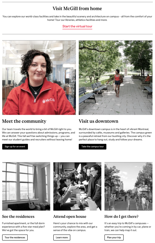
In the layout above, scale is used in a few ways to help users scan the page:
- The most important blocks are largest, and have the largest titles
- The most informative content in each block (the title) is larger than the other content in the same block
- Supporting information (in the first two blocks) is displayed at a smaller size
When deploying the principle of scale, remember that it's relative. Making everything big doesn't help users differentiate! The example above wouldn't work as well if all the blocks were the same size, or if all the text in the different blocks was huge. You'll need a clear order of priorities and a range of visibly different sizes to effectively communicate rank through scale.
Visual Hierarchy
Visual hierarchy is the term for how a user perceives the relative importance of items in a layout.
We communicate visual hierarchy in our layouts through use of position, colour, and scale (described above). These attributes combine to influence the order in which users' eyes move across a page or interface. A good visual hierarchy means that users will naturally pay attention to the most important thing on the page first, and address the remaining items in descending order of importance.
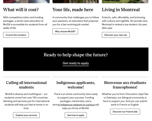
For example, we often format an important call to action as a full-width block (scale) at the top of the page (position) and using a red call to action button or link (colour). You can see an example of this above.
The button styling in call to action blocks is designed to support the importance of the content. (Based on the principle of scale, we assume full-width blocks are generally more important than half-width, which are typically more important than third-width.) Deliberate use of heading styles - heading 2 for the most important blocks, heading 3 and 4 for the titles of less important ones - is another way you can leverage the principle of scale to reinforce your choices about the block widths and improve the visual hierarchy of your layout. In this example, we also use color - the more important photos have a vibrant hit of red, while the less important ones are rendered in grayscale.
One caveat: what's "important" on a page will depend on what users are trying to learn or do during their visit. Sometimes users will visit a page multiple times, with different priorities each time. Your visual hierarchy my not always perfectly match their sense of what's important, but it'll give them a clear and useful structure to help them find what they want.
A good way to evaluate visual hierarchy is to look at the page with unfocused eyes (squinting and zooming waaaay out also work). This can help you get a rough sense of how your design might influence users' attention. If it looks like one big mass, review our recommendations for chunking (above). From there, you can use position, colour, and scale to distinguish each chunk and communicate their relative importance.
Contrast
The principle of contrast in UI design allows users to see differences in type, behaviour, or importance in aesthetic terms. (This is distinct from the definition of contrast in the context of accessibility.) Contrast helps users group content and can shape their expectations about how features work. Contrast expresses difference in a way that's more efficient than reading text content.
Like visual hierarchy (described above), contrast can be expressed with colour and scale. But while visual hierarchy is concerned with importance and reading order, contrast is an umbrella term for any type of difference - including differences that don't have anything to do with importance.

A simple example of this is when you're looking at a data table (shown above). Both the heading and the content are important, and the use of contrasting backgrounds allows your eyes to distinguish between them efficiently in order to get the information you need.
Another example is when filling out an online form or login process. Often, the "submit" button will be a bright colour or use a bold design treatment, while less important controls like "cancel" or "reset password" will have a different design treatment that stands out less. In this case, contrast and visual hierarchy both help users to click the item that's likely to be useful to them. In the example below, you can see how a key call to action ("get ready to apply") is styled to contrast with the informational blocks around it.
When making design choices, it's good to consider why something looks the way it does. If two things will lead to very different outcomes for the user, or vary greatly in their importance, then they should probably be styled differently. Conversely, similar things usually benefit from a consistent design. By using contrast only when it's needed, you'll leverage it more effectively...and avoid clutter (a.k.a. noise) in your layouts.
Signal to noise ratio
While not exactly a design principle, signal to noise ratio is an important concept in user interface design. In this concept, the content your users want is the "signal," whereas everything else is "noise." The takeaway: anything on your page that users don't find relevant is getting in the way of appreciating the content they want.
We always say you should keep it simple and concentrate on what your users need. These recommendations are intended to improve your signal to noise ratio. They apply equally to the content you write, the images you use, and the design choices you make.

You can see an example of this in the new search interface (above). When we designed this results page, we knew that faceted search options (to narrow results by type, faculty, etc.) would help advanced users find content efficiently. But we also knew that most internet users don't use search facets. If most of our users don't want or need the facets, then exposing all the options will add a lot of noise! However, it's still important to include the filters in a prominent place because some of our users consider them valuable. With this in mind, we made the choice to format the facets inside accordions, which would be positioned prominently but closed by default.
To help you optimize signal to noise ratio, ask yourself: What are my users really here for? Is there content I can strip out, edit down, or link to, so that the space it takes up is commensurate with its importance to my audience? Are the images in my page really supporting users and contributing to their understanding of the content? Which design cues are necessary to communicate structure, and which block styles, horizontal rules, buttons, and text formatting can I cut out?
Conclusion
The best way to leverage these principles (and avoid a steaming pie of competing content) is to start with clear priorities. These should be rooted in a genuine understanding of your users and their needs: this will lead to better outcomes and an easier process. Nothing builds consensus like real data. Once you know users' priorities and expectations, you can apply the design principles above to build a pleasant and efficient experience. A delicious success for your users and your site!
Applying these principles should boost the aesthetic appeal of your site, too: generally, users rate clean, clear sites as more appealing than busy or chaotic ones. But appealing visual design also relies on principles like balance, colour, and rhythm. Stay tuned for the next articles in our Design Principles series, which cover these (and more)!
If you're interested in additional design-focused content, please fill out our survey to help us develop additional resources and trainings that would be helpful for you.


