
The new WMS (Drupal 10) dynamically scales and crops images in blocks based on page layout, screen size, and selected focal point. There are also new ways of working with images outside of blocks.
In all cases, uploading a high-res image with the right dimensions is the key to making your site picture perfect.
-
Less is more
First, ask whether you actually need an image at all. Will it add meaning, or just vibes? Decorative images tend to create clutter, not spark joy.
Learn more about how (not) to use images.
If you do use an image, generally:
- Keep adjustments to a minimum.
- Skip the filters.
Professional photos are usually already corrected for colour and lighting.
-
Use a high-resolution image
Quality in = quality out. Blurry or stretched images instantly make a website look unprofessional.
- In this case, size does matter. Start with original, large, uncropped images whenever possible.
- If you crop or edit, save at the highest possible resolution.
- The new WMS has a file size limit of 30 MB. If a webpage has many large files, it can slow down performance. If you need to shrink your file, save as a JPEG. If necessary, you can lower the export quality slightly—but keep dimensions larger than the display size.
-
Get the perfect crop
Create visual rhythm and line up adjacent blocks by cropping images with a consistent aspect ratio—16:9, 4:3, and 3:2 are common ratios for web.
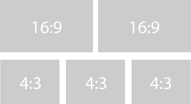
Image properties in the new WMS
In the new WMS, you can no longer set custom pixel dimensions in the WYSIWYG editor. Instead, choose from a selection of preset styles:
- Classic: Crops to a 3:2 ratio (536px or 800px wide)
- Natural: Keeps your original aspect ratio (160px, 320px, 536px, or 800px wide)
- Portrait: Crops to a 3:4 ratio (312px wide)
- Square: Crops to a 1:1 ratio (100px wide—small, good for logos)
- Default: Keeps original dimensions and ratio (customize before uploading)
You can also adjust the focal point for your image to change where it will centre when cropped.
-
Don't forget mobile
A high percentage of our web traffic comes from people using mobile devices.
Always review your site on a phone (as well as desktop) to make sure images look okay and check if you need to tweak any focal points.
Additional considerations for blocks
Dynamic scaling and cropping
The new WMS dynamically adjusts scales and crops photos in blocks depending on the block type, page layout, and screen size of the device being used to view the page.
For example, images in statement and list blocks may appear with their original aspect ratio in one or two column layouts on desktop, but crop to a 3:2 ratio on mobile or in tighter layouts.
Recommended dimensions
A very large landscape format, such as 2560 x 1440px (16:9) is ideal for almost all images. The higher the resolution, the more flexibility the system has to adapt while preserving quality.
For square or portrait images, a 1500px width can work—but unless the image composition is very specific, stick with landscape so the system has more room to scale and crop.
Exception: Call to action blocks
Images in call to action (CTA) blocks won't get cropped, they'll only scale to fit the block's display size. The image will always keep its original aspect ratio, so you should crop it to the desired proportions of your block before uploading to the WMS.
Aspect ratio and size recommendations:
- Square (1:1 aspect ratio)—good for large CTA blocks featured on a landing page or homepage.
- 2560 x 2560px
- 1500 x 1500px
- Portrait (2:3 ratio or wider)—a slight portrait crop may work, but it will depend a lot on the layout and image composition.
- 2000 x 2560px (tall/narrow)
- 1500 x 1800px (medium)
- 2000 x 2200px (closer to square)
- Landscape—works well for a smaller block.
- 2560 x 1440px (wide landscape,16:9)
- 2250 x 1500px (shallow landscape, 3:2)
Hero blocks
Hero block images will be scaled and cropped aggressively across devices, so extra high quality is a must.
Use the largest image possible for both the standard and text overlay hero styles (see an example of the new text overlay style on the UX examples site; requires VPN connection if off-campus).
- Minimum allowable size: 2560 x 1440px
- Recommended size: 3840 x 2160px
Dive deeper
- Designing Digital Experiences with the McGill Brand course
- Digital Design Toolkit
- Where to find images for your site
Get support
- Report an issue / Ask a question about the WMS
- Sign up for a Web Services Q&A chat session for hands-on technical help with your site
- Book a consultation for personalized guidance on larger-scale web projects


