
McGill is transitioning to a new virtual tour provider. During this time, you won't be able to create new virtual tour blocks. Stay tuned for an announcement of the new platform!
In response to demand from foreign applicants and prospective students who are unable to visit campus in person, Enrolment Services has created a new virtual tour of McGill. The tour showcases iconic locations like Roddick Gates and the Mac Campus Farm, as well as collections based on themes like Campus Life, Residences, and individual faculties. Although the tour was designed to showcase McGill for prospective students, it can help introduce McGill to a variety of audiences.
If you think the tour could be useful on your site, here are some tips for getting started.
1. Evaluate your audience
The tour is fun and exciting...until it gets in users' way when they're trying to accomplish something else. Before creating a link to the tour, ask yourself (and your team): Who visits our website?
Consider the information you have about your users (including their needs, interests, priorities, and commonly-used devices). Does your site serve audiences who could benefit from a virtual visit? If seeing your physical space could help them make a decision, evaluate their options, or access your services, then the virtual tour might be a good fit. (If your users are already familiar with your location or will never visit in-person, then the virtual tour probably won't be interesting to them.)
If you're not sure what your users' needs and motivations are, then it's best to do some user research before making any updates to your site!
2. Consider their journey
If you think your users could benefit from the tour, you'll need to make sure they're aware of it. First, you should present the tour to them when they need it: don't assume they'll remember where it was and navigate back to a previous page. Then, you should clearly show how the tour responds to your users' goals or interests.
Here are a few things to consider:
- What are the most common or important workflows users complete on my site? Are there moments in these workflows or journeys where a virtual visit would help users advance in their goal?
- Relevant goals might include making an evaluation of whether to apply; deciding which program to pursue; choosing whether to participate in an on-campus opportunity, etc.
- What will the tour help my users accomplish? How does it relate to their needs or interests?
- Users will be more likely to click if you describe the benefit using their words and motivations.
- For example, "Find your future study spot" might be more convincing than "See our facilities."
- Are there other places my audience might expect to see a link to the virtual tour, or might benefit from having access to it?
- An internal unit that works with prospective recruits (yet doesn't have a recruitment focus) might wish to provide users access to the tour without making it prominent on their site.
- Examples might be websites geared toward parents of students, or which offer technical support to prospective members of our community.
3. Pick the best format
Based on your user's needs, you can decide whether to use a promotional block or less prominent links in text or footers. Here's a rundown of your options:
The default virtual tour block
This block lets you promote the tour with a title, description, and a call to action link.
This is our recommended option if you think the tour is valuable for your users, but you don't want it to compete with the other options in your layout. It's simple to set up, loads fast, and is easy to adapt to whatever space you have available. If you use the virtual tour block, users can click to open the tour as a full-screen overlay of your site. When users close the tour, they'll return to the page they clicked from.
The panorama view variation
This variation of the virtual tour block shows an embedded panorama view of the stop you've selected. This panorama is dynamic - the view slowly pivots in place to show all 360 degrees of the location.
The panorama variation is great if you know your users will get a lot of value from the tour. By showing a preview image, users have a clear sense of the tour experience and how the tour could benefit them. However, the panorama can take a long time to load. If your users don't benefit from it, they waste time (and bandwidth) for nothing. This decreases their overall satisfaction with your site. If your users will be skimming your page quickly or using it on a mobile device, they might change their mind or move on before the panorama view loads.
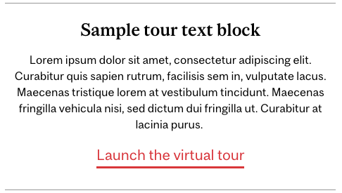
A footer or text link to the tour
This is a great option if you mention the tour in your content, or if users already know about the tour. (For example, if you've used a virtual tour block on another page or if they might have seen the tour on a previous step in their web journey.)
Sometimes, a user might expect to see the tour in your site's footer because there's a logical connection between the unit and the tour. This might be the case with a unit like Facilities, which is responsible for maintenance of campus, or Service Point, which interacts with prospective students.
Note that when they click a footer or text link to the tour, users will be taken to the virtual tour site (although you can specify the link to open in a new tab). Only the block options above can open the tour as an overlay.
4. Create your block or link(s)
Default Virtual Tour block
To create your block, you'll need to choose:
- A clear title that tells users why they should be interested
- A description that helps them decide to click (optional)
- Which tour stop your users should start on (to see the available stops, visit the virtual tour and hover your mouse over the left-hand side of your screen)
- A compelling label for your call to action link
Creating this block will be very similar to building other kinds of blocks in the WMS. To start, you'll select the "EAB Virtual Tour block" option in the blocks section of your site's "create content" interface. You'll create a label for your block, but leave the other fields alone until you get to the "Body" section. You can customize the size of your headings in the Body region (see more information about this in our call to action blocks writeup) and use text formatting to create an informative presentation and a balanced look in your layout. Like other types of block in the WMS, the virtual tour block can display at full-, half-, or third-width.
Remember that your content should focus on helping users make a decision to click. In general, the title will catch their attention; the description will provide supporting detail for users to determine whether it's worth clicking; and the call to action label will describe what happens if they click the link.
Once you enter your content, select your tour stop, and identify your view mode (half, full, etc.) you can publish your block! You'll chose its position and which page(s) it appears on using the normal block configuration options.
Note: Virtual tour blocks can be created in English or French, but not translated like normal blocks. This means that bilingual sites will need to create two blocks: one in English that they place on the English-language page, and a second one in French positioned on the translated equivalent.
Panorama variation of Virtual Tour block
To create a panorama variation of the Virtual Tour block, you'll need to choose:
- A clear title that tells users why they should be interested
- A description that helps them decide to click (optional)
- Which tour stop your users should start on (to see the available stops, visit the virtual tour and hover your mouse over the left-hand side of your screen)
- The image size that works best for your panorama image and block placement
As with the default version, you'll start by selecting the "EAB Virtual Tour block" option in the blocks section of your site's "create content" interface. You'll create a label for your block, but leave the other fields alone until you get to the "Body" section. Like the default version of the block, the Panorama variation can display at full-, half-, or third-width. As with the default, you can manage the size of your headings (see more information about this in our call to action blocks writeup) and modify your text to create a sense of visual hierarchy and balance. Make sure that your title and description are sufficiently clear for users to understand the block even if there's a delay in loading the panorama image.
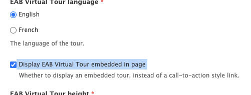
Once you've entered your content and selected your tour stop, you'll check the "Display EAB Virtual Tour embedded in page" checkbox, which will reveal your options to set the panorama image height and width:
The block will look best if you keep the panorama's width at 100%, since this will fill the available space. You're free to manipulate the height to showcase more of the image or to align better with the surrounding blocks, but we recommend using percentages (rather than pixel values) when specifying the height. This allows you to optimize for desktop while providing the flexibility for the block to adapt to other screen sizes.
To help you determine which height is best, here's an example of a half-width panorama beside a text block:
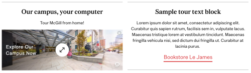
In this case, the 100% height option creates a nice height alignment with the neighbouring block when viewed on desktop. On mobile, the 100% height option shows a compact but informative view. You can use an even shorter height if necessary, but less than about 80% may make the panorama image hard to see. If you don't have much space, the default version (described above) might be better.
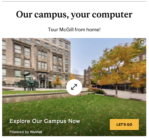
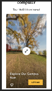
You can also specify a taller height. Here's an example of a full-width block with a 300% height to provide an immersive view of the Mac campus waterfront:

Notice that the taller panorama views have a "let's go" call to action button, which provides some additional encouragement for users to click. Just remember that the height will look a little different on mobile: more than about 300% may require some users to scroll in order to see the full image, so be careful.
Here's what 300% height looks like on a smaller mobile screen:
Note: As mentioned above, virtual tour blocks can be created in English or French, but not translated like normal blocks. Some of the text inside the panorama (e.g. "Explore now!") may still appear in English, even if the tour's audio narration and other settings are translated. We're working to resolve this issue with the tour vendor.
Footer or text links
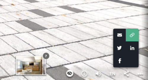
You can create a basic link to the virtual tour just like any other website. You may wish to use the main tour URL (which begins at the Roddick Gates) or get the URL for a specific stop. You can do this by navigating to your desired stop in the tour, clicking the "share" icon (represented by the symbol that looks like < ) and clicking the "link" icon:
For more information
The tour block is available to all WMS sites and documented in our Knowledge Base. If you have technical difficulties with the block, submit a support ticket through IT Support website.
Interested in evaluating how the virtual tour fits with your digital strategy? Looking for help embedding the virtual tour on a non-WMS site? Request a consultation!
We always appreciate your feedback, so let us know how we can serve you better. Fill out our short survey to share your thoughts.


