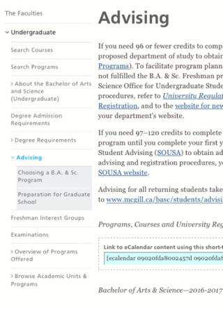
Those of you who keep a close eye on McGill’s websites may have noticed a recent style update in the WMS, vertical menus have undergone a refresh and now display a new cleaner, lighter and easier-to-navigate design.
Site visitors are now presented with a first-level vertical menu with grey text on a white background — a colour contrast improvement over the old black text on a grey background.

Other updates include:
- Better usability, including an arrow indicator for items with child pages
- Expanded child items are indented to make it easier for visitors to determine which level of the site they have navigated to
- Active pages are distinguished by bright blue text, as opposed to the grey text used for non-active pages
- A lighter look
- The menu can now hold more items with less space, vertically and horizontally.
- Background color displays only on 3rd level nesting, rewarding site managers that keep well organized shallow nested content, with a clean looking menu.
The revamp of the vertical menus was in part informed by feedback received from site managers, editors and members of the McGill community. A big thank you as always to those who have provided input in this project.
Bon appétit tout le monde!
Find out more about the WMS:


