You might have noticed that the WMS is looking a little different these days. And more changes are coming! In this article, you'll learn about how the Web Services Group (WSG) and Digital Communications work together to improve the WMS. We'll describe our approach to branding and updates, what we've been working on this summer, and where we're headed next.
Granular approach
The WMS contains over 900 sites run by literally thousands of site editors and managers. That means improvements to the WMS can have huge value...and an equally huge negative impact if something goes wrong. To manage that risk, we follow a granular approach to updating the WMS.
Granular means we update small pieces, which over time add up to a large change. By reducing the scope of each individual update, the changes become easier to test and the level of risk is easier to assess. Smaller updates also promote an efficient cycle of improvements: we can deliver valuable changes quickly and collect user data sooner, leading to more valuable improvements.
While exciting, large or "monolithic" changes can have many dependencies which make it difficult to evaluate risk and ensure a smooth deployment - and changes like that can require more training and adaptation for already-busy site administrators. In contrast, the granular approach maximizes value and minimizes disturbance to our 900+ sites.
Foundational changes
There are a few different ways to break changes up into manageable, granular pieces. One way is by breaking down the foundational elements of the WMS and updating each one in turn. Foundational elements can include things like typography, color palette, and icons. These elements pervade the design of the WMS, and generally apply to all features used on all sites. A change to a foundational element is visible everywhere that element is used, so there's a big payoff!
Foundational elements also tend to be supporting players: ubiquitous, but not ostentatious. Since they're used in a variety of ways, foundational elements are generally flexible and neutral in character. As long as we honour the versatility and approximate proportions of the originals, updates to foundational elements can be done with little risk.
For most people, such changes are also less obvious. When we launched the updated fonts, for example, the response was similar to when a colleague gets a haircut. Some folks said, "Wow!" and knew exactly what had changed. But most people didn't say anything - many had the feeling something was different, maybe better, but they couldn't put their finger on it.
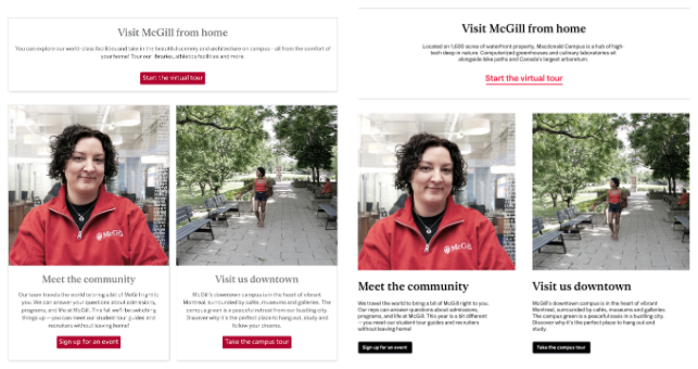
This is the response we expect for our most recent granular change: updating the colour palette of the WMS. To smooth the transition, we took our lead from the existing WMS palette in order to support existing sites' use of colour and composition. However, the new palette is vastly simpler and has a higher degree of contrast. This puts more emphasis on content and images, aligns better with our new brand direction, and ensures compliance with accessibility standards related to readability.
At the top of the page, you can see a comparison of the old colour palette (left) and new (right). This minor-looking change has another important benefit: it makes our entire WMS compatible with the colors and typography we'll use in the more striking design changes to come.
Component changes
These more obvious changes will be apparent as we rebrand individual features or, as we call them, components. These include features site administrators can add and manage directly, such as call-to-action blocks, webforms, and menus. Components can also be user interface (UI) elements that the WMS supplies for you, like the institutional footer with the McGill logo at the bottom of every site. Components are typically based on the foundational aspects of the site's design, but how the component's design uses those foundations can be changed radically without disturbing other elements of the site. This allows us to be more ambitious in the design changes we make.
A component change won't affect other components, but its perceived impact may vary. For example, an update to the footer design may be barely noticeable, since it's only visible at the very bottom of the page. For features like call to action blocks, statement blocks, or webforms, a change will only be visible on pages that use the feature...but if it's a prominent feature on your page, then the change will be equally prominent.
Components in the WMS are well-documented and generally used as designed, so (as with foundational elements) we're able to predict risk and thoroughly test possible use cases. For example, soon we'll update the design of call to action blocks. The new designs will retain the same features and flexibility as the old versions, but their styling will align better with our brand and with the different ways these blocks are used to create structure and a clear visual hierarchy. But of course, these changes won't affect other block types in the WMS, and they won't affect your site if it doesn't use call to action blocks.
Here's a rough side-by-side comparison between our current call to action blocks (left) and draft designs (right):
A note about foundational elements vs. components
Folks with sharp eyes will notice that the recent font changes haven't affected the header and main menu of their site. These areas of the site are a little more critical - and sensitive to font size - than other areas, so we decided to isolate them from the font updates. Instead, we'll include the font changes in the redesign of the individual header and menu components.
As a result, we could deploy the fonts everywhere else relatively quickly, and can learn from simpler and less visible component updates before tackling the highly visible header and menu redesign. Whether we treat something as a foundational element vs. a component - and how far we go with that distinction - will sometimes come down to whatever creates the best balance between efficiency, impact, and risk.
What's next
As we pursue the gradual rebranding of the WMS, you can expect more announcements from us. These messages will give you advance notice of design changes and will help you evaluate the impact on your site. In some cases, we may get in touch with you directly to help fix a problem or adapt your site in preparation for a change. This is more likely if your site is complex, if you use unique features, or if you use features in non-standard ways.
For this reason, we always recommend that you use features in the way they're intended. Creative uses can expand the possibilities of the WMS (which we love!) but when they go too far, they can have unpleasant consequences. Common misuses like placing text in images or using "big numbers" as headings, for example, can prevent certain users from accessing your content and hurt your search engine rankings. A clever "hack" might also break (or look really weird) when we update the component or foundational elements it's based on.
When in doubt, get in touch to see if you're using a feature responsibly.