As you know, we're making gradual updates to the WMS' design. Our next update will be simplifying the WMS colour palette, aligning it with our new brand and our accessibility obligations for text contrast. We anticipate the impact overall to be visible, but minor - we're not changing how the WMS works, just how it looks! Above, you can see a comparison of the old palette (left) with the new (right).
Of note, this update will remove the blue colour currently used for text links in page content and replace it with the clean and universal underline. In the future, both the link and underline will now match the colour of surrounding text - a modern look that is used on the homepage, Giving site, and other new sites. (Since links and regular underlined text will now be identical, this is an additional reason to never use text underlines for emphasis. Bold and italic text styles work better!)
Linked text in headings (heading 2, heading 3, etc.) will also be underlined. However, users don't usually expect headings to contain links. The underlines will add more emphasis to them, but may also add unwanted visual clutter. This is a great opportunity to review your site's content and see if a different strategy would be better for you and your users.
Below, we'll run through a few common scenarios where you might be tempted to link text that's styled as a heading. For each, we'll provide some ideas for user-friendly alternatives.
Case 1: Visual emphasis
You have special content at the top of your page that's important, and you want users to see and click on it. Instead of providing a text heading and then using body copy for your instructions and links, you make the whole section a large heading, links and all. This is the case in the example below - you can see the old palette on the left, and the new version on the right.

This appears to work well - your links stand out! - but making something bigger doesn't mean users will respond the way you want them to. In this example, the instructions and options blend together, so they're harder to scan. The sheer amount and size of the text also can feel overwhelming. Bear in mind that your users can only look at one thing at a time: your goal is to create an easy path to help them find what matters on the page. Concise content and clear visual hierarchy will help. Too many competing elements (large sizes, bold text, etc.) will get in the way.
In cases like this, you have a few options:
- Transform your important content into a full-width block, which will stand out from the rest of your content.
- Statement blocks allow you to create multiple buttons for desired actions.
- A Call to action block puts strong visual emphasis on a single link.
- Standard blocks are clean, flexible, and allow you to list links (using the "normal" text style) in a numbered or bulleted list.
- Use the normal text style (rather than heading) for a list of links in your content, and structure surrounding elements so that users can easily scan the page to find what they need. For example:
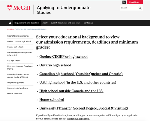
- Create concise, compelling headings (e.g., "Find your admission requirements") to quickly communicate the most important information about each section.
- Use formatting techniques like bolding and lists to create emphasis and structure.
- Transform each important link (e.g. Quebec CEGEP, Ontario High School) into a block
- This works well for a small number of options (6 or fewer).
- Multiple blocks allow you to add images and/or supporting information for each option. This can add visual emphasis and help users identify the correct option for them.
In some of these strategies, you may be inclined to use your block titles as links. If you do, they'll still be more structured (and easier to scan) than the example above. But have a look at the next use case to see some other options!
Case 2: Block titles
You're creating blocks that direct users to other pages or sites, and the block titles seems like an obvious choice for your links. The block titles are visually prominent and contain a concise description of the destination that the links point to. Linking them seems logical. Less is more, right?
Generally, titles serve as structural elements. They provide a description for the content and/or actions to follow - users may not interpret them as action items in themselves, or may not have enough information to act on. A more common strategy is to use the block title to introduce an idea (e.g. "Visit the downtown campus") and then use a clearly worded button to specify the action users should take (e.g. "Schedule a tour").
Instead of linking block titles, you can:
- Use block styles that include buttons (Call to action blocks, Statement blocks)
- Take advantage of the title to attract user attention by using language or themes that speak to their needs and motivation.
- Use a clear and compelling button label to encourage them to click.
- Provide images or additional information if (and only if!) this will help users decide to click. Very generic images contain little informational value, and may distract from your real content.
- Place your link(s) directly in the text of the block
- You can make a list of links in a Standard Block, or simply create links directly in a block's text description.
- This is a great strategy if you want to provide supporting details or additional links without distracting users from the main page content.
Case 3: An abundance of caution
Sometimes, you might want to link a title just in case your users try to click on it.
Maybe you linked your headings because the text that follows includes multiple links, and you're worried users will need a simple "default" option. Or perhaps you're worried that the normal-sized text links will be too small for users to click easily (particularly for users with mobile devices or other limiting factors).
In these cases, you can still link your titles...but you might want to ask yourself what you're worried about. Consider whether other strategies might address your concerns. Why not simplify your options so users know where to click, or use buttons instead of text links in order to provide larger tap targets? You may also wish to conduct usability testing to understand your users better.
The exception that proves the rule?
We said that text headings aren't expected as links, and that they usually serve as structuring elements in your content. This is true, with one exception: certain types of content lists like news feeds, event lists, and search results. In these cases, headings - which represent the title of each article, event, or result listed - are always links in the WMS.
But since there's only one logical destination for such links, why should we force users to click the heading? If we treat each content item in a list as a "card," a user can click anywhere to access the page a content item represents. This creates nice, easy tap targets for mobile users, and eliminates any ambiguity about clicking on metadata like author name, category, or venue. (These elements could link to different pages, but this behaviour isn't expected in content lists.) This emerging best practice is already used on the McGill.ca homepage...stay tuned to see if it spreads to other parts of the WMS!
Questions?
If you have any questions, concerns, or urgent support requests, please itsupport [at] mcgill.ca (contact the Service Desk). For consultation services, fill out the request form.