To use chunking, you need to show users which elements should be read as a chunk. Proximity and region are the main ways users understand relationships between elements like headings, paragraphs, buttons, and images.
When we use proximity, we place related objects close together. Unrelated objects are further away. You can see two proximity-based groupings below:
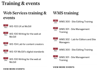
Even though there are no dividers or backgrounds, our eyes naturally read "Web Services training and events" as one chunk, and "WMS training and events" as another. Thanks to proximity, we can easily tell which events (and which "view more" link) belong to each heading.
When we use region, related objects are contained together in a box or outline. You can see two types of region-based grouping in this example:
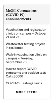
The "coronavirus announcements" heading is contained in a gray background. This separates it from the actual announcements, which share a white background. And the entire block is contained within an outline, separating it from other chunks.
To demonstrate the power of proximity and region to improve readability and visual appeal, here's an example of a page that doesn't use clearly defined regions:
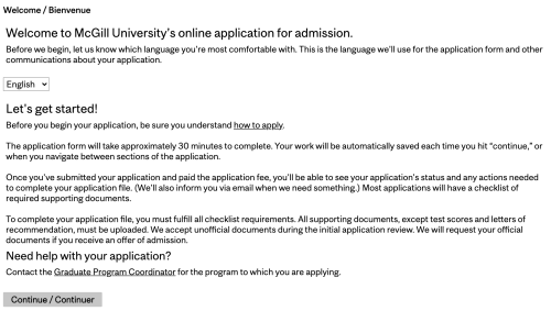
The paragraphs and sections are broken into reasonable chunks, but the spacing around the headings isn't sufficient for the eye to read the relationships easily. Similarly, the language switcher is equidistant from all the content around it. This means there's no clear sense of where it belongs.
Here's another version of the page, this time with content chunks defined using proximity and region:
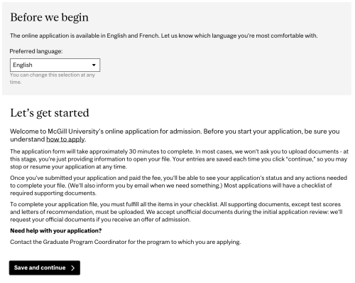
You can see how the "before we begin" region is clearly defined and separate from "let's get started." Some typography, content, and spacing corrections also help group the content in the chunks. This gives better context to the language switcher and "need help" content. (Now you see why it's helpful to start with complete content and tweak it as you progress with your design!)