As mentioned a few weeks ago, we're moving forward with redesigned WMS call to action blocks (including the "enhanced" call to action block style).
What's changing
The new blocks will have a more open, brand-aligned style; limited use of the McGill red; and more deliberate use of left-aligned versus centred text. We also added new options for button and heading styles, and put some thought into how to improve the mobile experience with the blocks.
Button styles
To create more pleasing, content-centric layouts, the regular call to action blocks will now use different button styles for the call-to-action (CTA) link. The style used will depend on the size of the block, which generally correlates to the level of visual emphasis desired.
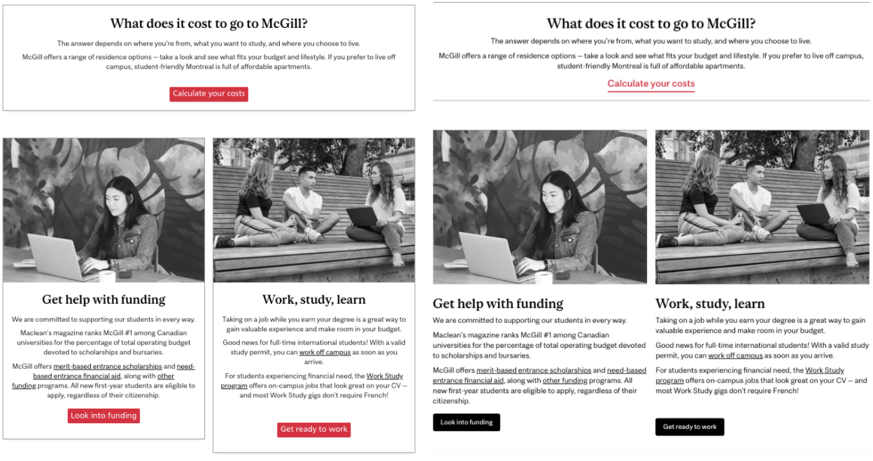
- The full-width versions will use McGill red.
- Generally a full-width call to action block is used to call attention to an important item on the page, so the red CTA will help these blocks stand out.
- The half-width will use a solid black button.
- This will reduce visual clutter, while still providing important visual emphasis for the CTA buttons.
- The third-width and sidebar options will use a transparent button with contrasting text and outline (also called a "ghost" button)
- This makes the CTA button easy to find, but minimizes visual competition between elements.
For text-only full-width blocks, including enhanced call to action blocks, the CTA link will use a typography-based styling. The larger type and thick underline give a balanced look with more visual appeal. Here's a comparison of a mixed-block layout in the original design (at left) and the updated design (on right).
Heading sizes
All call to action blocks (regular and enhanced) will now allow display your choice of heading style (heading 2, heading 3, etc.) used in the "body" area of the block. Previously, all heading styles were displayed as a "heading 3," regardless of your selection. Now, you can use different styles to add structure and visual hierarchy to your block layouts.
This means that you should verify that the blocks on your site use the heading style that's appropriate for the content. In particular, check your half- and third-width blocks to ensure that the heading styles match the block(s) directly beside them. If the heading styles are mismatched, the blocks may look a little odd!
Mobile experience
On desktop, full-, half-, and third-width blocks typically correspond to very, moderately, and less important content in the page’s hierarchy. The button styles (and perhaps your choice of heading sizes) help reinforce this. However, the length of the blocks and the size of the screen make this hierarchy less evident on mobile. For this reason, we removed images for third-width blocks on mobile. These blocks lead with the typography instead, which creates a sense of visual hierarchy, reduces page length, and has the potential to lighten page load times.
Left versus centre alignment
Our new call to action blocks use left-aligned text and buttons in all blocks that include images. This generally has a more modern look, and aligning the text with the left edge of the page (anchored by the image) creates an obvious visual grouping and facilitates users’ typical page-scanning behavior. It also allows us to fit slightly more information on a single line of text, helping shorten block-heavy layouts. For these reasons, we’re trying to make left-alignment our “default” in the WMS, and limit centred text to specific instances where we want to “break” the pattern.
When a block has no image (on desktop or mobile), the typography becomes more important. We thought centering the content for these blocks made sense, since the change in alignment would add visual interest and help create a clearer visual grouping.
The changes to alignment mean that call to action blocks will look best when following typical use patterns: using square or rectangular images (square being the preferred format for our new branding) and/or including some supporting information, like a heading or descriptive text in addition to the button. If you're looking for more flexibility or to accommodate a different use case, we suggest building a custom layout with ghost buttons.
What's next
One of the next things on our radar is widening the WMS to a more modern page width. In addition to making more efficient use of screen real estate, this allows us to rethink (and add!) space between elements in the WMS. This will affect the call to action blocks above, as well as most other features of the WMS. Stay tuned!
Questions?
For more information on how to use call to action blocks, check out our original articles on regular and enhanced call to action blocks.
If you have any questions, concerns, or urgent support requests, please submit an issue through our new self-service IT Support site. For consultation services, fill out the request form.