In our last newsletter, we put out a call to creative souls to help us design a new logo for the LTOA Program! We were so thankful to receive a very special design from Lisa Wilson of Lillooet, BC. Below, hear from Lisa about how she created the logo, and what it means to both her and the LTOA program.
![]()
Tell us about yourself!
K̓alhwá7alap, my name is Lisa Wilson. I am half Cree, half St̓át̓imc. My mother is from Kasechewan, a Cree community in Ontario, and my father is from Xaxli'p, a St̓át̓imc community in British Columbia. As for me, I have currently been living on St̓át̓imc territory and am a registered Xaxli'p band member. I am a 22-year-old university student at Thompson Rivers University working towards the Bachelor's (then hopefully Masters) in Social Work. I am aiming for a Social Work degree in hopes of one day becoming a clinical counsellor to aid my people. With my mother working in health, I am no stranger to the healthcare system and it has piqued my desire to enter the field myself. Moreover, with many of my family members being survivors of the Indian Residential Schools, I plan to use the intergenerational hardship that have been passed onto me, as a tool to relate and aid others who have inherited the same traumatic after effects of colonialism.
I come from a family of artists, my late father being a well-known traditional artist in our community and my mother and siblings being hobbyists like myself. I entered the digital art world as a teen and I've been enjoying it ever since, I enter logo contests and do digital commissions here and there but I mostly just create for my own enjoyment. Personally, art has always been a great tool for self- reflection and expression and it will probably be a hobby of mine for as long as I am able to create it.
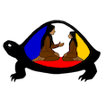
Why did you choose to create this logo?
 I created this logo because the LTOA program description really resonated with me. I love supporting anything that has to do with bringing culture back to our people. Using culture and community support as preventative healing techniques aligns strongly with my belief that the land, the language, and the people are a strong enough foundation to help Indigenous people be proud of who we are and rise up after the continued negative affects of colonialism.
The colors represent the four colors of the medicine wheel (one of my home communities uses blue instead of black, so I went with that since it fit better aesthetically), and since the medicine wheel is a used in nations across the country it works great as a symbol for culture and healing. I also wanted the shape of the turtle shell to mimic that of a sweat lodge since that is also a huge indigenous cultural symbol. I have always found them to be a very healing and communal sacred ceremony growing up. The two people represent communal engagement. I made one an adult (or Elder) and a youth to represent the passing of teachings between generations. I also wanted this logo to be ambiguous enough to be interpreted in many more ways that even I never thought of while creating it!